So, instead of letting it remain in my head and cause undue stress*, I will vent here :)
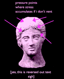
<begin rant>Here we go. Reversed-out text [white on black or any variation thereof] is great! for making a point, as a header, for emphasis, for a logo, the list goes on. It does not, repeat NOT look good for a whole page of copy that you want people to read. Yet, many [dare I say amateur...or is that just too mean?] designers lean heavily towards it. Why is this?
It kind of reminds me of when I used to do ceramics [ I was ok at it, but not brilliant] at a local community center and because I could throw and could paint, I made some not too shabby pots. Hobbiests (sp?) would come in and say stupid things like "Oh, that's neat-- how long did it take you to make, I want to make one too" with a certain tone that implied it was a piece of cake. Let me tell you, it's not easy to make a good pot. Well, my reply was usually " a couple of hours or days". But oh, how I longed to say, "Well, for your information, I went to art school for a gadzillion years and studied both ceramics, painting, photography, and [sputter] art history too, quite extensively thank you very much. And even with all that, ceramics does not come easily". That segue probably didn't make sense. oh well. <end rant>
Email me and let me know if you agree or disagree (about the reversed-out text I mean). Strong opinions welcome.